A Homily on Data Visualization


A Homily on Data Visualization
Here is a video on the correlation between health and wealth on a global scale.
In addition to presenting some interesting information (e.g. the life expectancy a mere 5 or 6 generations ago was in the low 40s), this video is an example of the power of data visualization. One difficult software challenge is designing interfaces that take complex, rich sets of data and present those data so that they can be quickly understood by users. This has an obvious application in healthcare (in particular, clinical) environments. As I’ve often heard Lee say, clinicians need “the right data in the right place at the right time”. A corollary to this may be “the right data that can be easily comprehended and acted upon in the right place at the right time”. Now, this video is a particularly compelling example of this; it is “a story of over 200 countries shown over 200 years and beyond. It involved plotting over 120,000 numbers.
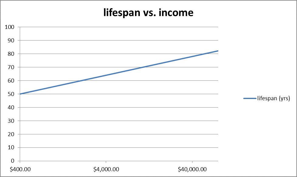
Two things about this video caught my eye. First, notice the horizontal axis—income

There are three equally-spaced ticks for $400, $4,000 and $40,000. This is a logarithmic scale. Basically, this makes exponential growth curves look linear. Now look at this:

I added the green line to show the trend, which appears linear. Here
is a simple graph representing the same data, for purposes of demonstration:
Now, let’s see what happens when we change the horizontal axis from a
log scale to an absolute scale:
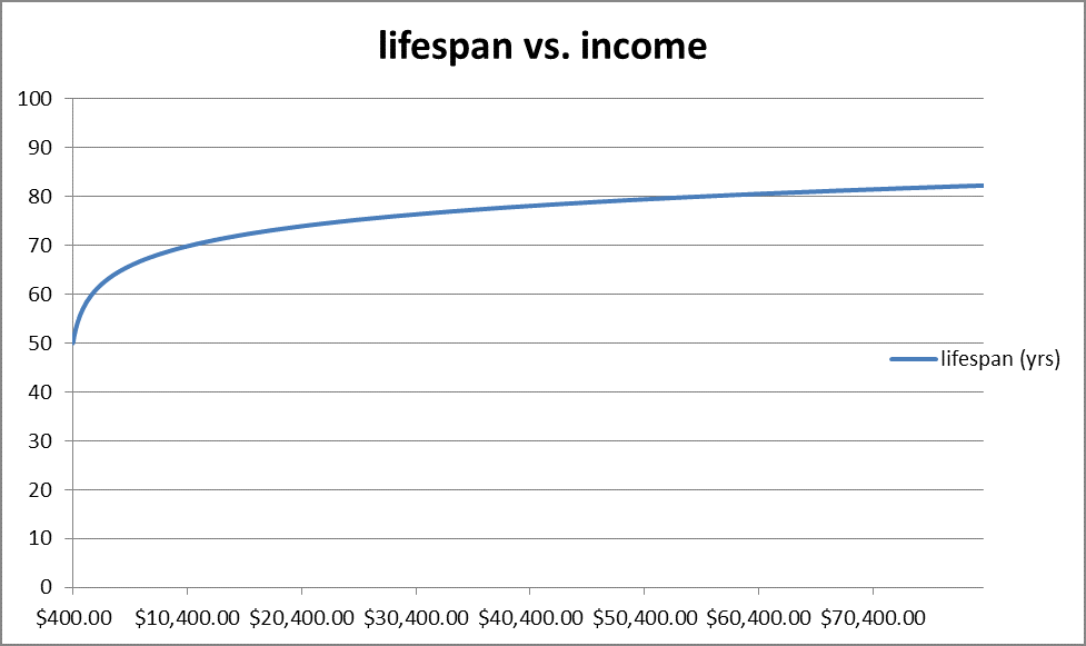
A trend appears that wasn’t obvious in the original graph. Namely, lifespans
are asymptotically approaching a ceiling of around 85 years. As presented in the video, one might conclude that the correlation between wealth and health will persist forever!
This reminds me of what one of my favorite philosophers, Nassim Taleb, calls “the Problem of Induction”: namely, is it possible logically to go from specific instances (i.e. a set of data) to general conclusions? Consider the Parable of the Turkey, as told by Taleb his book The Black Swan (Taleb attributes this story originally to “über-philosopher” Bertrand Russell (who preferred chickens to turkeys):
…a turkey is fed every day. Every single feeding will firm up the bird’s belief that it is the general rule of life to be fed every day by friendly members of the human race “looking out for its best interests,” as a politician would say. On the afternoon of the Wednesday before Thanksgiving, something unexpected will happen to the turkey. It will incur a revision of belief.1
In chart form, it would look something like this (attribution again to Taleb, where similar chart is presented on p. 41 of The Black Swan):
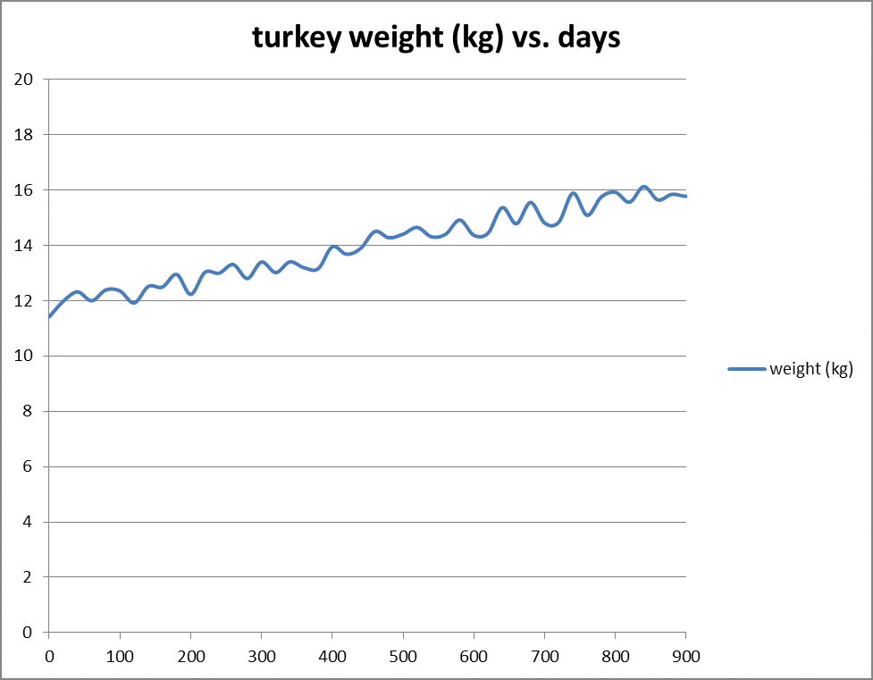
At first glance, one immediately induces a principle: as time goes on,
turkey weight tends to increase. But, this isn’t the whole story. What happens at day 1001?
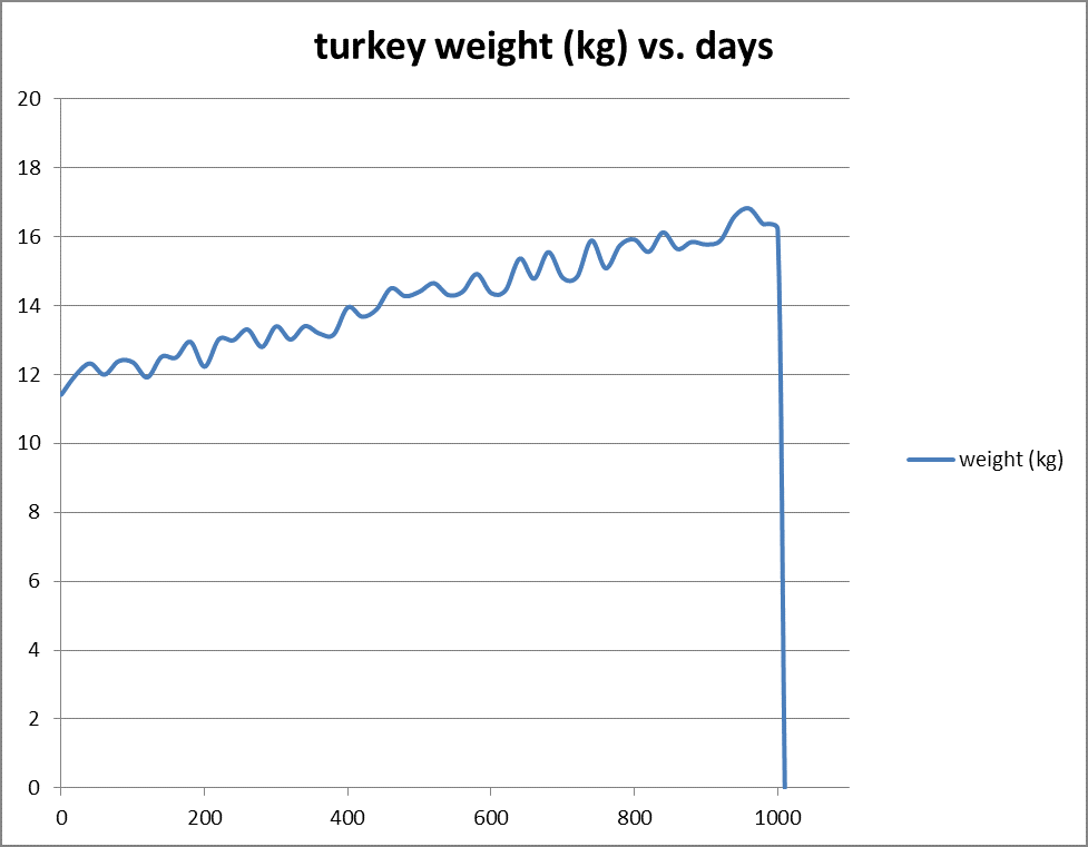
Not the stuff a typical turkey MBA anticipates. Or, channeling Yogi Berra:
“the trend is your friend until it ain’t.” Gathering good information from complex data sets requires not only the skills to present the data in a format that is easily comprehended (digested?),
but also with the experience to counteract the amazing—but often problematic—power of the human mind to find patterns and relationships where, often, none exist. A data visualization interface
that isn’t put together properly can amplify “the problem of induction”.
1Taleb, Nassim, 2007, The Black Swan: the Impact of the Highly Improbable. New York: Random House, p. 40.
also RELATED TO THESE TAGS

Case study – Ortho Banc
Empowering patients and practices to make better informed finacial decisions takes the fear out of purchasing dental work…

Case study – St Jude
UX assessment and design of remote heart monitoring system informs client usability and user interface upgrades…
Case study – Philips
State-of-the-art application interface design improves product usability and reinforces promise of excellence…
TALK with US
Digital Health Expertise to Support Your Success.
PointClear Solutions’ strategy, design, development and management services can help elevate your brand reputation, grow your market share and boost your revenues — all in record time. Connect with us to learn more
Complete the form below, so that we can connect you with the right person. You’ll hear from a member of our team shortly.